SPARK for Autism
Strategic Analysis and Proposed Website Redesign

OVERVIEWProblem
Our goal was to broaden SPARK's reach among individuals with autism and their families while boosting new community memberships by performing a comprehensive analysis and redesign of SPARK for Autism’s website, focusing on accessibility, information architecture, and SEO.
Outcome
We discovered pain points, made recommendations to improve the user experience, and proposed a new sitemap and wireframes to drive increased conversions.
CLIENTSPARK for Autism (SPARK)
is an autism research study and a growing community of autistic individuals, their families, and researchers on a mission to advance the understanding of autism and to improve the lives of people with autism. As part of this effort, they collect and study DNA from people with autism and from their family members.
INFORole
UX Researcher & Designer
Team
2 UX Researchers & Designers
Myself
Responsibilities
I completed a content inventory, performed a competitor analysis, moderated card sorting sessions, helped redesign the information architecture and wireframes based on research, and presented findings to SPARK.
PROCESSWe drew from multiple UX research and design methodologies to evaluate the website, identify insights, and provide recommendations for improvement.

CONTENT INVENTORYContent inventory key insights
We performed a content inventory to assess the overall content of the site, cataloging all content on the site’s main pages and 40 of the articles in the Discovery page and evaluated: site navigation, content organization, and internal and external links.
1
A single-level global navigation was ineffective with the volume of content in the site
2
Several navigational labels were vague and unhelpful for effective navigation
3
Navigational labels and page names were inconsistent
4
Some pages were insufficiently differentiated, causing confusion
5
There was a lot of redundancy, with repeated content and links throughout the site

A portion of our content inventory
IDENTIFYING PAIN POINTSWe did a quick evaluation of some of the main pages and identified several pain points around the site’s usability and accessibility:


COMPETITIVE ANALYSISWe analyzed our competitors, identified common trends, and applied the best ideas to SPARK’s redesign.
After conducting an in-depth analysis of several websites sharing similar objectives to SPARK's, we identified trends and evaluated their respective strengths and weaknesses. Through this process, we identified areas where SPARK's strategy could be enhanced and translated these insights into actionable recommendations.
Some lessons learned from competitors and recommendations for improvement include:
1
Implement persistent global navigation featuring dropdown menus for easy access to subcategories positioned along the top of the page.
2
Incorporate a prominently placed search bar at the top right corner of the website, to enable users to search the entire site for specific information more efficiently.
3
Establish a distinct navigational section exclusively dedicated to account creation, login functionalities, and contact information, to facilitate seamless user interaction.
4
Use a navigation scheme that caters to multiple types of users’ preferences and needs, such as audience-centric, content-driven, and task-oriented approaches.
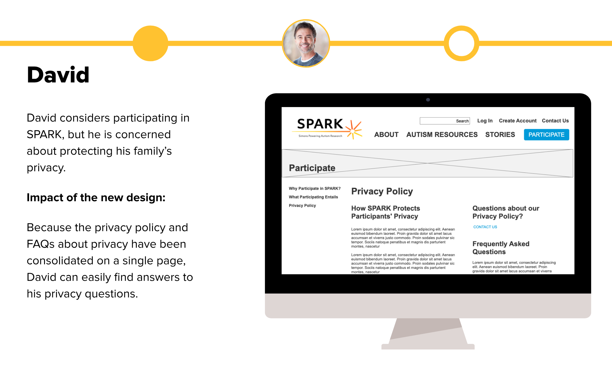
5
Privacy is a big deal to users, especially when it comes to their DNA. Put privacy and confidentiality information front and center and include it in the Participate page.
6
Users should be able to easily access FAQs. Make FAQs more accessible and link important questions to pages including in-depth information elsewhere (e.g., topics related to privacy, saliva collection process, etc.).
Check out more of our findings below.


PERSONA CREATIONWe discussed the site’s primary users with our client and created personas based on the information provided.


CARD SORTINGWe conducted card sorting to uncover users’ mental models to inform the new information architecture.
We conducted card sorting with 20 participants, including 2 participants with ASD and 2 parents of children with ASD.
We used a hybrid approach, allowing users to sort cards into existing categories and to create new ones.
1
We learned that we should have created categories for FAQ, Login, and Help/Support.
Most participants created at least one of these as a new category
2
Articles needed more descriptive titles to more accurately reflect content.
Participants had a lot of confusion over whether article cards belonged in “Resources” or “Stories”
3
“Community” deserved consideration as a potential new label.
Several participants created this as a new category
The results of our card sort in a standardization matrix
4
A lot of content can be linked to and from multiple places.
Stories can be linked to Resources and Stories categories; Login/Account as its own category and linked to by Participation category; FAQ
CREATED NEW SITE MAPBased on the insights we had gained up to this point, we proposed the following information architecture:
1
About
SPARK’s mission, staff, partners, and contact info
2
Autism Resources
Autism research divided by topic and audience
3
Stories
Spotlights on SPARK participants and researchers
4
Participate
Why participate, what participating entails, privacy
5
Contact
Contact information, social media accounts, FAQs
Our proposed site map (see additional details below)
6
Login
Log in to an existing account, create a new account


SEO ANALYSISWe analyzed SPARK’s current SEO profile to determine the site’s ranking in user searches and identify areas to improve.
We performed:
Keyword analysis
HTML code evaluation
Manual Google search
Speed test
1
Reduce the amount of time it takes for the site to load.
Overall the site is slow to load and makes a lot of requests, some of which are unsuccessful. This is especially detrimental to mobile searches. Make less HTTP requests during page load to address this.
2
Include an XML site map.
SPARK’s search rankings showed a lot of room for growth. Placing an XML file on SPARK’s web server would allow search engines to crawl the site more effectively.
3
Use more descriptive language throughout the site to create better “keywords” and “tags.”
This should occur in the headers, paragraph content, etc. The keywords on the homepage are mostly relevant and are not overly repetitive. “Study” and “participate” may need to move up in the ranks to be more searchable.
4
Make the code cleaner and more consistent.
Good use of headings makes pages more searchable, and H1 tags that reflect the theme of the page should be used on each page. Use best practices, including proper HTML headings (e.g., H1 tags that reflect the theme of the page, H2 tags for pages with multiple sections, etc.) and more keywords in the Keywords meta tags.
ACCESSIBILITY REVIEWWe used a web accessibility evaluation tool to evaluate how accessible the site was, especially for those with disabilities or special needs.
This was especially important as SPARK’s demographic includes individuals with ASD. We uncovered areas to address, including:
1
Change link colors
Replace yellow links (inaccessible on white background) with a color that meets accessibility standards
2
Repair broken links
Ensure all links work properly and redirect to the correct page
3
Fix HTML validation errors
Ensure all code complies with W3 Consortium standards
WIREFRAMESWe created wireframes of the pages central to our redesign based on our understanding of SPARK’s goals.

PUTTING IT ALL TOGETHERWe translated our recommendations into low-fidelity screen flows.
To ensure that our recommended improvements to the information architecture and general layout of the site were aligned with user needs, we created some scenarios depicting likely screen flows for three of our user personas. We believe the updates would serve as effective improvements to the current state.


CLIENT RESPONSE